Roll20 uses cookies to improve your experience on our site. Cookies enable you to enjoy certain features, social sharing functionality, and tailor message and display ads to your interests on our site and others. They also help us understand how our site is being used. By continuing to use our site, you consent to our use of cookies. Update your cookie preferences .
×
Create a free account

Scale bars and status icons with token size

Score + 232
1419490852

Edited 1421032911
DXWarlock
Sheet Author
API Scripter
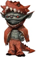
If the bars height, name font size, and status icons scaled to the size of the tokens. Then zooming in, or having smaller tokens than the default grid size would be much less cumbersome, For example this is default: This is a quick horribly done photoshop mockup of what I mean: When using a 0.5 grid size, and adding tokens bars, they end up as big as the token is tall, and the status markers are massive. If the bars and status scaled a % of the default 70x70 size (say 70x70 is 100% a 35x35 token would make them 50% smaller also). This is my players party in a dungeon, zoomed in a hair so they could see what's going on..and its terribly messy looking. The bars take up the entire grid above them, and status icons cover the entire token if you have more than one: Add in 5-6 mobs they are fighting and its just a mess of huge bars and icons with a foot or arm sticking out under the jumbled mess. We ended up turning off names since that just added to the problem as they don't scale font size with token size either:
1419536977
vÍnce
Pro
Sheet Author
Agree 100% with this. There are similar suggestions as well which may indicate a trend. Token Handles should resize when zoomed out. The size of the distance measurement should scale with zoom levels
1419564366
Gold
Forum Champion
Thanks for making those demonstration graphics, William. Also Vince for linking 2 other related thread topics. I agree with this request. I've experienced all the same issues in some of my games & maps. I really feel I could run a better game (and expansive map acreage) with small tokens & dense grid, which can be achieved by improving the scaling of these sorts of graphics in the tabletop interface.
Aha someone had a similar idea to me then :)
I'm sad that this hasn't happened yet.
+1 This should have been long implemented by now.
+1 This would be very useful for someone that has really big maps but small tokens. In my games I can't use any of the status Icons as they just obscure the whole token :(
This is a huge issue on the mad mage maps. The bars are taking up so much space!
Adding my vote, this would be nice to have. Especially for players working with GM's who haven't quite figured out align to grid and token sizing yet.
+1 Well I totally agree, also just the fact, that seems wierd in somce cases... like the red cross for dead character, depending on the scale of the grid size it either look good or like the token has a red pair of pants on...
+1.  Absolutely.  And they the hell does roll20 make adaptations of Wizards' modules at 0.5 unit size?  It messes up everything!  One unit should be 5 feet, everything would be sooooo much simpler if they followed that common-sense rule.  I wish Dungeon of the Mad Mage wasn't all at 0.5 unit scale. Now the bars, icons, and indicators clobber the tokens. And if your name has more than 4 letters, it spills across the map and overlaps with the person next to you.
If they're going to change the scaling of the bars, I'd like to also see the position change as well. There's no reason for Bar 1 to be in the center of the square above it.
+1 Yes a lot less clutter
+1 I need this so bad
Yep, started Mad Mage on 0.5 and its Horrible the HP are the size of the Token
+1 Absolutely, good sir. Sign me up.
Still revelant 5 years later!
+1 especially since the default is 70 x 70.
Me : There's a thread on this already...awesome! Also me :  It started five years ago? :(
North said: Me : There's a thread on this already...awesome! Also me :  It started five years ago? :( ... and it's still open! D: I added a vote.
Why are we still waiting for this? +1
Five years, goodness me. Well, as long as it's live, here's another +1!
+1 Five-year-old request, sigh.
Can we have this please? I just bought castle ravenloft maps and it's a pain in the ass the scale that produces this
+1 from me aswell. Just created some battle maps for a campaign and uploaded some custom markers before realising that they did not scale with my .5 map scale.
+1 please!
Yeah... It's pretty self evident this would be a great option. +1!
+1
It's a must need feature +1
Five years. This is just sad.
Yup. +1
+1   (technically +10 for me and my players)
This is DEFINITELY needed for all the maps in their implementation of Rime of the Frostmaiden!
Absolutely needed! i too had to turn name off.. and also the condition marker clutter all the images...
+1 was disappointed to find this that old of a request
This would make those large "Out of the Abyss" maps that I bought in Roll20 actually functional.
+1
+1
+1
+1 
+1
+1
+1
+1
I swear, I vote on almost every 5-6 year old QoL post. +1
+1
+1
+1
+1