Roll20 uses cookies to improve your experience on our site. Cookies enable you to enjoy certain features, social sharing functionality, and tailor message and display ads to your interests on our site and others. They also help us understand how our site is being used. By continuing to use our site, you consent to our use of cookies. Update your cookie preferences .
×
Create a free account

Show Off Your Style 2: The Stylening!

1600347514

Edited 1600347781
Oosh said: Andrew said: The dice appear to be drawn on a canvas element, so they don't have traditional elements for styling. However, since this canvas seems to be specifically used for the 3D dice, the canvas itself can be messed with...  Example: <--- SNIP ---> Holy crap that is cool. But, if I'm understanding right, this will make all player dice the same colour? Or does the filter apply differently to 
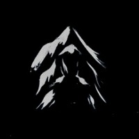
different base colours? Hue-rotate will make the player dice different colours; different base colours will result in different final colours. I haven't looked into how it actually works, but from what I've seen using it, I think it can be imagined as starting from a point on a gradient wheel (such as the one below) and rotating by a number of degrees. So starting on blue with a 180 ° rotation would result in some sort of yellow, starting on green with the same rotation would result in some sort of pink. However, I should point out that I'm using this to illustrate the effect it has, this wheel probably doesn't line up precisely with the actual results from hue-rotate.
1600407464

Edited 1600411406
Persephone said: Mik H. said: That's odd Persephone, I'm not seeing the character name disappear on my end. When I turn on the script it looks like the icon is entirely removed. I don't know enough about CSS to move elements like the icon to a specific part of the text, sorry!  <...> <...> Turning the setting off doesn't change anything except remove the icon, which isn't visible with the style anyway. I commented out lines 4-6 so the icons are visible, but the names are still missing and I can't figure out why... @Mik, it looks like line 63, float: right, is the issue. For some reason the new update made this push the text all the way out of view. I've commented it out, so names are just at the top: I've also added the following to keep the icons the correct size (they otherwise appear several pixels larger than they should be): .sheet-action_icon .sheet-icon-1-action, .sheet-action_icon .sheet-icon-2-action, .sheet-action_icon .sheet-icon-3-action, .sheet-action_icon .sheet-icon-free, .sheet-action_icon .sheet-icon-reaction { height: 20px; } With the new template, actions set as Other show an asterisk instead of an image, but I can't find a way to either shrink it or hide it (it also appears much larger than without the style, as well as lower than normal): EDIT: Also, I found that changing the left and top for sheet-action_icon with !important can be used to move the icon into the template, but not in a way that prevents it from overlapping with long character names, headers, or subheaders. Tried setting it to appear just above the template, but it resulted in more overlaps, and again the asterisk for Other actions kinda ruins it:
1601893434

Edited 1601893461
Oosh
Sheet Author
API Scripter
Word Wrap in Code Boxes Very simple, helps if you spend a bit of time on the forums playing with posted code: .post .postcontent pre, .note-editable pre { white-space:pre-wrap; } No more running off the edge of the box, much easier to copy someone's horrible macro code. I tried to find a way to restrict the range of Ctrl-A to the code box, but it doesn't look like that's possible without jQuery. Test box: aaaaaaaaaaaaaaaaaaaaaaaaaaaaaaaaaaaaaaaaaaaaaaaaaaaaaaaaaaaaaaaaaaaaaaaaaaaaaaaaaaaaaaaaaaaaaaaaaaaaaaaaaaaaaaaaaaaaaaaaaaaaaaaaaaaaaaaaaaaaaaaaaaaaaaaaaaaaaaaaaaaaaaaaaaaaaaaaaaaaaaaaaaaaaaaaaaaaaaaaaaaaaaaaaaaaaaaaaaaaaaaaaaaaaaaaaaaaaaaaaaaaaaaaaaaaaaaaaaaaaaaaaaaaaaaaaaaaaaaaaaaaaaaaaaaaaaaaaaaaaaaaaaaaaaaaaaaa aaaaaaaaaaaaaaaaaaaaaaaaaaaaaaaaaaaaaaaaaaaaaaaaaaaaaaaaaaaaaaaaaaaaaaaaaaaaaaaaaaaaaaaaaaaaaaaaaaaaaaaaaaaaaaaaaaaaaaaaaaaaaaaaaaaaaaaaaaaaaaaaaaaaaaaaaaaaaaaaaaaaaaaaaaaaaaaaaaaaaaaaaaaaaaaaaaaaaaaaaaaaaaaaaaaaaaaaaaaaaaaaaaaaaaaaaaaaaaaaaaaaaaaaaaaaaaaaaaaaaaaaaaaaaaaaaaaaaaaaaaaaaaaaaaaaaaaaaaaaaaaaaaaaaaaaaaaa
1601909835
keithcurtis
Forum Champion
Marketplace Creator
API Scripter
Simple yes, but very useful.
1601936764
Oosh
Sheet Author
API Scripter
Just keeping the thread ticking over... don't want it to end up like the poor old NPC Chat Menu thread :(
1602543355

Edited 1602662457
The character sheet for Blades In The Dark has a notes field that specifies a font I find...well, unreadable. It also uses a ruled background that doesn't scroll with the text. This mod removes the background entirely and subs a more readable font (which of course you can set to whatever you like; I'm using Blokletters Viltstift, a nice free handwriting font). If there's a way to make a ruled background that scrolls with the text, let me know and I'll update this. I'm a decade out of practice with coding & such. /* * Roll20, Blades in the Dark charsheet notes * * Remove lined background (it doesn't scroll with the text) and * change the font to something more readable. */ .charsheet .sheet-notes { background: none; padding: 4px; font-family: "Blokletters Viltstift", cursive; font-size: 11px; line-height: 16px; }
1603160919

Edited 1603161051
Oosh
Sheet Author
API Scripter
Blue Dice on /r Rolls and Inline Tooltips An inline roll result that is both a critical and fumble has a nice blue border. This blue colour doesn't seem to be applied to either /r rolls or to inline result tooltips. This code will enable that, to give a third roll colour in all roll formats. A couple of other tweaks, commented in case you don't like them - they might be a bit much on a lower res screen. /* slight transparency & rounding on inline tooltips */ .tipsy-inner { opacity:0.85; border-radius:10px; } /* "/r" roll results, brighter colour & heavier font */ .diceroll.critsuccess .didroll { color:#288c00; font-weight:800; } .diceroll.critfail .didroll { color:#ce0000; font-weight:800; } .diceroll.critfail.critsuccess .didroll { color:#05f; font-weight:800; } .diceroll { font-size:20px; } /* inline roll tooltip blue rolls */ .basicdiceroll.critsuccess.critfail { color:#0da0ff; font-weight:bold; } /* slightly round & embiggen inline roll result box */ .textchatcontainer .inlinerollresult { padding:0 4px 0 4px; border-radius: 3px; font-size:1.25em } Colorblind/custom color helper And here's a bunch of other relevant classes if you wanted to change the 3 available colours to something more appropriate to your eyeballs, or just sense of aesthetics. Also the last few classes will essentially change the entire right sidebar colour - I do remember one poster saying the blue of the chat log really messed with their eyes. /* change the background of the inline tooltip */ .tipsy-inner { opacity:1; border-radius:0px; } /* "/r" roll results */ .diceroll.critsuccess .didroll { color:#247305; font-weight:800; } .diceroll.critfail .didroll { color:#a80000; font-weight:800; } .diceroll.critfail.critsuccess .didroll { color:#05f; font-weight:800; } .diceroll { font-size:20px; } /* inline roll tooltip text */ .basicdiceroll.critsuccess { color:#0F0 } .basicdiceroll.critfail { color:#FF4D4D; font-weight:bold } .basicdiceroll.critsuccess.critfail { color:#0da0ff; font-weight:bold; } /* inline roll chat box & colored borders */ .textchatcontainer .inlinerollresult { background-color:#FEF68E; border:2px solid #FEF68E; padding:0 3px 0 3px; font-weight:bold; cursor:help; font-size:1.1em } .textchatcontainer .inlinerollresult.fullcrit { border:2px solid #3FB315 } .textchatcontainer .inlinerollresult.fullfail { border:2px solid #B31515 } .textchatcontainer .inlinerollresult.importantroll { border:2px solid #4a57ed } /* chat message backgrounds to change the whole right sidebar */ .textchatcontainer .message.general { background-color:#d3d3d3!important; } .textchatcontainer .message.rollresult { background-color:#d3d3d3!important; } .textchatcontainer .spacer { background-color:#d3d3d3!important }
1603162528
keithcurtis
Forum Champion
Marketplace Creator
API Scripter
Very nice. I particularly like the fully commented color changers. That could be a real help for people with color perception problems.
1603852424

Edited 1603855045
Ivo
Pro
Hi, I'm having some trouble getting this to work. A few things. I notice in the top post you mention the Stylus Extension. When you click the links however it now takes you to a different extension -> Stylish Under the original Stylus Extension there seems to be no way to add styles( Resolved, taking a look now, ok, have two of them working now, ok on fire now, all under control, awesome mods! ). Under the new Stylish Extension there is a way to manually add styles(the auto install only works on some of them), which I have tried with varying degrees of success. Some of the code has Mozilla references which Stylish doesn't seem to like, these are Chrome/Firefox styles? When adding the regexp condition for some of them, does that go in the URL regexp checks(doesnt seem to work) , or just as  a line in the code (doesnt seem to like it) Any help appreciated, thanks in advance.
1603856315

Edited 1603856810
I am using the card-hand widening set and it's great, but I also wanted to enlarge the cards so I could see their details better. Unfortunately, it enlarged the pane from the top, making the whole thing cover the button to close it! Does anybody have an idea how I could make the cards bigger without scaling the whole pane? I'm guessing I'll have to muck with "cardinhand" but I'm not sure how....
1603858168

Edited 1603858285
keithcurtis
Forum Champion
Marketplace Creator
API Scripter
Ivo said: . I notice in the top post you mention the Stylus Extension. When you click the links however it now takes you to a different extension -> Stylish Use one of the first two links ( Chrome ,  Firefox ) to install the Stylus extension. The "[Install]" links actually take you to userstyles.org, which was originally built to serve Stylish. The site still lists Stylish in its iconography because of this. But if you have Stylus installed and click any of the links, they will install in Stylus instead. Stylish was abandoned by many folks after it was discovered that they were not being trustworthy with user data. Stylus was built to be an alternative.  Try installing Stylus and see if the Install inks still give issues. If you have installed Stylish, I would recommend you uninstall it first.
1603887484
Oosh
Sheet Author
API Scripter
Nik G. said: I am using the card-hand widening set and it's great, but I also wanted to enlarge the cards so I could see their details better. Unfortunately, it enlarged the pane from the top, making the whole thing cover the button to close it! Does anybody have an idea how I could make the cards bigger without scaling the whole pane? I'm guessing I'll have to muck with "cardinhand" but I'm not sure how.... This should get you started: #playerzone .deckhands .hand .handcontainer .cardinhand img { max-width: none; max-height: none; scale: 1.0; } The image dimensions are constrained by default. You'll probably need to tweak the container size, too - don't forget about max-width/height if the size won't adjust properly. I couldn't figure out how to change the size of the draggable card. It looks like this is the class popping up: .cardinhand.ui-sortable-placeholder But it's giving me peanuts. See how you go!
1604863402

Edited 1604863470
Scott C.
Forum Champion
Sheet Author
API Scripter
Compendium Curator
Responsive Page Toolbar The new update to the toolbar is great when you've got lots of maps and need to move through them like crazy. It's not so great if your campaign is small and doesn't have rows and rows of pages. It's also not the easiest to read if you use longer page names for some of your pages. With these issues in mind, here's some simple CSS to make the toolbar more responsive: /*Responsive page toolbar size*/ #page-toolbar:not(.closed), #page-toolbar:not(.closed) > .container{ height:auto;/*sets the page toolbar and the container in it to size their height as needed based on their content*/ } #page-toolbar.closed{ top:-320px!important;/*this custom css seems to interfere with the JS based animation of the toolbar opening and closing. This makes sure that the page toolbar is properly placed when closed*/ } /*End responsive toolbar*/ /*word wrap on page names*/ #page-toolbar:not(.closed) .pages .availablepage{/*I decided to lay the thumbnail and label out using grid*/ height:auto; display:grid; grid-template-columns: auto; grid-template-rows:auto 1fr; grid-template-areas:/*We wind up with two grid areas; the "label" where the span will be placed and the "map" where everything else will. These two areas are placed one on top of the other*/ "map" "label"; place-items:start center;/*This makes sure everything stays aligned and justified like it should*/ } #page-toolbar:not(.closed) .pages .availablepage > :not(span){ grid-area:map;/*Place anything that isn't the span in map. We're not doing anything to the default placement logic on the buttons and player banner*/ } #page-toolbar:not(.closed) .pages .availablepage > span{ /*The first two properties are needed to overwrite the default placement of the span*/ position:relative; bottom:initial; grid-area:label;/*Then we assign it to the label grid area*/ white-space:pre-wrap;/*And set it to wrap and preserve whitespace*/ } /*End wrappable page names*/ Before: After:
1605072379

Edited 1605074490
Oosh said: Nik G. said: I am using the card-hand widening set and it's great, but I also wanted to enlarge the cards so I could see their details better. Unfortunately, it enlarged the pane from the top, making the whole thing cover the button to close it! Does anybody have an idea how I could make the cards bigger without scaling the whole pane? I'm guessing I'll have to muck with "cardinhand" but I'm not sure how.... This should get you started: #playerzone .deckhands .hand .handcontainer { max-width: none; max-height: none; scale: 1.0; } The image dimensions are constrained by default. You'll probably need to tweak the container size, too - don't forget about max-width/height if the size won't adjust properly. I couldn't figure out how to change the size of the draggable card. It looks like this is the class popping up: .cardinhand.ui-sortable-placeholder But it's giving me peanuts. See how you go! I didn't get a notification about your reply and just saw it. A scale of 1 makes the cards very large indeed, and putting it at 0.5 leaves a lot of space around because it doesn't change the positioning. This got me the desired effect for the hand display: #playerzone .deckhands .hand .handcontainer .cardinhand img { max-width: 160px; max-height: none; } Thanks! For the dragging, .cardinhand.ui-sortable-placeholder is the invisible spacer that remains where the card you are dragging was. I got a brief glimpse in the inspector of a .ui-sortable-helper, as I was dragging a card, but haven't figured out what settings to give it to make it bigger. And, I haven't been able to get it to appear in the inspector again while I'm dragging it so I'm not sure where in the hierarchy it sits.
1605240521

Edited 1605307821
Oosh
Sheet Author
API Scripter
Styling Token Action buttons I did mean to throw this in here a while back, but I forgatted. There was an earlier post about coloring token action buttons by order on screen, but this one will style them according to the actual macro they represent, so they'll look the same no matter which token you have selected. Here's a plain old token action bar, with universals mixed in with some Ability macros for the selected token: You can start out pretty simple, just apply a different color to Ability macros so they're easy to tell apart from Collections macros, and make them stand out a little better: #secondary-toolbar .mode.tokenactions li button { margin-right:5px; border: 2px solid; } #secondary-toolbar .mode.tokenactions li button[data-type="ability"]{ background: orange; Then we can get a bit more creative with an individual button. For that we need to grab the [data-macroid] property of the macro. This can be found in the HTML inspector under Secondary Toolbar, or in the Collections tab by right-clicking a macro and inspecting it. That needs to be pasted in to the CSS selector: #secondary-toolbar .mode.tokenactions li button[data-macroid="-Lz7ZupXmab9veL6W_TG|-Lz7oZFllhfxI1XBh7KZ"] { background:#704570; color:white; font-weight:bold; font-size:18px; text-shadow:none; border: 3px solid; border-radius:10px; } I couldn't find a way to change the order of the Collections macro buttons - although it is a list item, all the buttons are contained in the same list item. However, you can rename them with numbers at the start to get them in the right order, then rename them by using this, just changing the content: ""; line to your preferred label: #secondary-toolbar .mode.tokenactions li button[data-macroid="-Lz7ZupXmab9veL6W_TG|-M--C3LjkYn5tx8nTwN9"] { font-size:0px; } #secondary-toolbar .mode.tokenactions li button[data-macroid="-Lz7ZupXmab9veL6W_TG|-M--C3LjkYn5tx8nTwN9"]::after { content: "Z comes first!"; font-size:14px; vertical-align:middle; } We've now got a big old Initiative button, and a Collections macro apparently starting with 'Z' coming first in the list: We can tidy up the order a bit - as Keith pointed out, turning off Alphabetical Sorting of Token Actions in the settings tab will shift all the Ability macros to the start of the sort order. Then I guess you could get carried away if you wanted to, and make some crazy big buttons with an angry bear face! #secondary-toolbar .mode.tokenactions li button[data-macroid*="-Lz7ZupXmab9veL6W_TG|-LzCO8q7tiF22Yobe-l4"] { color: white; background: #fff0 url('<a href="https://s3.amazonaws.com/files.d20.io/images/28445014/Z344L_EyhfFKEzQ_wHhM1g/original.png" rel="nofollow">https://s3.amazonaws.com/files.d20.io/images/28445014/Z344L_EyhfFKEzQ_wHhM1g/original.png</a>') center; background-size: 150px 110px; border:none; height:100px } Anyways, it's a little clunky, and hardly worth the bother for a player. But if you've got quite a few GM universal token actions, it's an option to make them a little more readable.
1605282813

Edited 1612726966
keithcurtis
Forum Champion
Marketplace Creator
API Scripter
If you turn off the option to display them in alphabetical order they will display thusly: Token Actions on sheet, in the order they appear on the sheet Universal Token Actions in the order they appear on the Collections tab (Alphabetical). You can sort the first group manually by dragging them up and down the list in the character sheet. Show Off Your Style 2: The Stylening! has Auto-closed. To follow, continue with: Show off your Style 3: Third Time is the Charm!
1605307966
Oosh
Sheet Author
API Scripter
Very true! Though I've had issues getting character ability macros to stay in the order I put them in. Edited the post to clarify that it was the Collections macros that I couldn't work out how to reorder (with CSS), thanks.