Roll20 uses cookies to improve your experience on our site. Cookies enable you to enjoy certain features, social sharing functionality, and tailor message and display ads to your interests on our site and others. They also help us understand how our site is being used. By continuing to use our site, you consent to our use of cookies. Update your cookie preferences .
×
Create a free account
This post has been closed. You can still view previous posts, but you can't post any new replies.

Circle tokens vs Overhead?

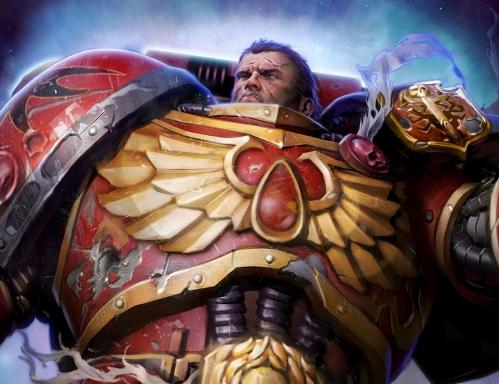
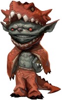
I am working on custom tokens for my campaign. I made a bunch of circle tokens but...eh... And I noticed a lot of people use over head tokens on Roll20 but...eh.... I am trying to spice it up. This is what I got so far: And this: I figured a close, above the collar bone shot is the best. But I duno if enemies facing Right and allies facing Left is a good fix. Maybe there is something to Bids-Eye-View shots...
1398080250
Gauss
Forum Champion
Moved to On-Topic (there was no suggestion made).
1398080838
Pat S.
Forum Champion
Sheet Author
I've seen portrait and topdown tokens in uses and it boils down to user preferences. When I do maps I prefer topdown because it matches up with the map layout but alot of players like using portraits of their character avatar. Either works and the facing doesn't matter because of the ability to right click and flip the tokens facing deals with that but that might be a gm only option also. Those tokens you are showing are nice also.
I have a Token document in Photoshop that is pre-setup with circles for Medium, Small, and Tiny creatures, so when I need a new one I can just drop the art in, crop it, and upload. There's enough art on the internet to never have lack of choice. I like the top-down ones, I think they are a bit more flavorful (I use really high-detail maps), but unfortunately the selection just isn't enough. I don't have the time to be modifying them custom to fit the enemies I need when I run an adventure, so it's easier to just use the artwork provided. Also I have all of the tokens I have on Mediafire for free so anyone can just grab them. It makes it easy for players to pick a character token quickly.
Circle tokens. Token Tool for quick and easy ones, use paint.net to make nicer looking ones for boss monsters and PC's.
1398136971
Gen Kitty
Forum Champion
I prefer portrait tokens to top-down views. I can more clearly see what the token is supposed to be. That said, I've seen some good top-down tokens in the free art library so I'm not totally against them for stuff the PCs will be killing.
Top down? Circle? I use something like this: Gives as much space to show the picture but you still can see background in the gaps. Have to make all NPC with one color tho, as this is no MMORPG and player decisions determines if NPC is enemy or friend.
Hey Lex. Interesting that you suggested that idea. I ended up going for a square token as well with the head cropped put so the background shows underneath. I'm on my phone right now so I can't show you what I got. I tried the border all round but trying to experiment with something else . the border creates a lot of squares so when looking at a group it creates a sort of checkered effect I'm trying to experiment against. Picking one color for all NPC and one for PC is definitely good idea and something I recommend. One thing I'm thinking of doing is instead of using that color on the token itself mine using the status effect marker to indicate. Say a Red dot for enemy, blue or yellow o white for player and black for neutral? Another big thing is detail at all sizes. That frog is cool but doesn't look good when it's small. This is why I don't like the border. At first I thought of creating a consistent thickness of border between all sizes. So a huge token's border would look just as good as a medium tokens. The idea if using status effect markers solves this. I'll post more here as I progress.
Man. Soon many typos.. Sorry. On my phone!
I like the top down view, mainly because of the look. I also like having the players have to remember the important NPCs, one of my games is centered around a Bar where they have to speak to different people to get info, some want money, some are xenophobic, some want information for information, some are drunken idiots. I enjoy watching the players struggle to figure out who is who. Typically there are about 30 NPCs in the bar, Dirty Frank's , a low dive with continuous entertainment.
1398182179

Edited 1398182342
Pat S.
Forum Champion
Sheet Author
Efraim S. said: Picking one color for all NPC and one for PC is definitely good idea and something I recommend. One thing I'm thinking of doing is instead of using that color on the token itself mine using the status effect marker to indicate. Say a Red dot for enemy, blue or yellow o white for player and black for neutral? The downside to the one color for npcs and another for pcs is the fact that there are people that are color blind or have a very limited color recognition. Trying to think on how to express it. Ok: Most people see in 32 bit color but there are some people that can only see color in 8 bit or 4 bit and there are some that can only see color in 2 bit (these people is who most people think is color blind). I know I can only see a limited amounts of color (I consider my color vision functions in the 8 bit range) so you might want to take some of that in consideration also. I'm not saying that the choice is wrong but it is something some artist don't take into account and don't understand why some people are not impressed/WOWed from their art.
I did take that into account but did not mention it. If you use Roll20's status marker system (the little colored dots) then hopefully the GM can adjust for any color blind people. It also allows to switch the color from an Ally to an Enemy and neat stuff like that. There is an extra step to the user but I think it might be worth it.. Still not sure... Either way- great point MK! And Al e. I would love to get a peek at Dirty Franks!! Got any screen shots?
1398204076
Lithl
Pro
Sheet Author
API Scripter
MK said: Efraim S. said: Picking one color for all NPC and one for PC is definitely good idea and something I recommend. One thing I'm thinking of doing is instead of using that color on the token itself mine using the status effect marker to indicate. Say a Red dot for enemy, blue or yellow o white for player and black for neutral? The downside to the one color for npcs and another for pcs is the fact that there are people that are color blind or have a very limited color recognition. Trying to think on how to express it. Ok: Most people see in 32 bit color but there are some people that can only see color in 8 bit or 4 bit and there are some that can only see color in 2 bit (these people is who most people think is color blind). I know I can only see a limited amounts of color (I consider my color vision functions in the 8 bit range) so you might want to take some of that in consideration also. I'm not saying that the choice is wrong but it is something some artist don't take into account and don't understand why some people are not impressed/WOWed from their art. Bit-depth is not a very good comparison for colorblindness. You comparison falls particularly flat if you examine what "2 bit color" actually means: 4 distinct values of color (00, 01, 10, and 11). And yet, a person suffering from monochromacy can distinguish between many colors, even if they can't identify any of them (think about what a "black and white" photograph looks like: you get many many shades of grey). The big problem is that there are three kinds of colorblindness: monochromancy ("sees in black and white"), dichromancy (missing one cone/one cone has significantly diminished functionality), and anomalous trichromancy (one cone is sensitive to the wrong wavelengths). Monochromancy can either result from completely missing all three cones, or suffering from multiple forms of dichromancy. Anomalous trichromancy (deuteranomaly in particular) is the most common type of color "blindness". In someone with monochromancy, it is impossible to distinguish hues, but lightness/shades are fine. For someone with dichromancy, it's like applying a color filter lens to a camera (eg: someone with protanopia sees red as black, sees purple as blue, etc.). Anomalous trichromancy is a bit more complicated, as all of the cones are there, but one just works a bit differently than it ought to, creating confusion between colors, such as red-green, blue-green, or yellow-red.
1398208802
Pat S.
Forum Champion
Sheet Author
I'm sorry that I wasn't correct but I was just trying to make a general inferred comparison about the difference that people that don't suffer from it compared to those that do suffer from color blindness.
I've not yet run my Campaign but I'm doing [mainly] top down views, transparent backgrounds, on hex for the 'battlemap' with colour-coded front [green] and back [red]. Then a character portrait for the character sheet, or notes, so players see both views. I'm not yet sure if I will be able to use top-down exclusively for the battlemap, but if not then anything can be put 'within' the hex.
<a href="https://www.tavern-keeper.com/campaign/424/discuss" rel="nofollow">https://www.tavern-keeper.com/campaign/424/discuss</a>... and <a href="https://drive.google.com/folderview?id=0B0rh5VAy81" rel="nofollow">https://drive.google.com/folderview?id=0B0rh5VAy81</a>... Here is an update of my attempts at tokens. Still haven't picked a style I'm happy with.
1399467334

Edited 1399467418
Michael H
Plus
Sheet Author
Here are my tokens. Just took screenshots from the PDF of The One Ring, and made them round in Photoshop. Works like a charm.
I prefer the circle tokens. I made these color coded one's in photo shop. I make the players pick these colors to, so that way it matches journal entries and their character portriat on the screen.
I like the Top Down, but then I'm a miniatures player before an RPG player
1399643384
Tom
Plus
Sheet Author
I'd definitely use more top down tokens-if there were more available for my genre of game (seventeenth century swashbuckling horror). About my only options now are pirates, pirates, and...oh yes, pirates. And maybe a few cherry picked fantasy tokens for monsters. So while I like the look of the top down tokens, I'll stick with circles because they are easy to create myself.
1399907320
Fred Lang
Marketplace Creator
FYI, PixelFigs will have both top-down and circle tokens for every set of models I release. The top-downs will release first, and then I'll add a circle version afterward. :-)
1399908029

Edited 1399908037
Gid
Roll20 Team
I'm a fan of Phillip Wright's oblique projection of his minis. Gives you a top-down feel, but can still see their face and their wardrobe, similar to JRPG sprites.
Going to give the top downs a try. - Cheers
As a D&D 3.5 player, the rules say facing doesn't matter. So for player characters, I use portraits (Some of which have been drawn by the players themselves. I know a few good artists!) bounded by circle borders. These are all made by script automation in GIMP, my image editor of choice. For all NPCs and monsters, I just use whatever I've pulled out of Roll20's art library search engine. I may star some of these or save them to a figure page if I use them a lot.
John R. said: Circle tokens. Token Tool for quick and easy ones, use paint.net to make nicer looking ones for boss monsters and PC's. Nice tokens, I really like how they pop out of the frame. Where do you get your ring graphics?
1401548217

Edited 1401548257
B Simon Smith
Marketplace Creator
I prefer circular tokens. Every time I've been in a game with overhead tokens, they tend to get lost in the background. Plus, unless you play a game that requires facing, I haven't really seen a need for top-down. I'm probably going to whip up some circular borders soonish... in the meantime here's three that I planned on using with a Shadowrun campaign: Blue Circle - <a href="http://imgur.com/FeGSvAz" rel="nofollow">http://imgur.com/FeGSvAz</a> Red Circle - <a href="http://imgur.com/q9C1fMM" rel="nofollow">http://imgur.com/q9C1fMM</a> Green Circle - <a href="http://imgur.com/e4HOcQg" rel="nofollow">http://imgur.com/e4HOcQg</a>
1401578827

Edited 1401638023
Nice tokens, I really like how they pop out of the frame. Where do you get your ring graphics? Thank you, I will put them all in a dropbox and link here soon for you. I got some from google image search others from DM's in various games I have met on roll20. Here you go dropbox with my templates there are 4 different folders one with examples, one with png images, one with .net (for use with pain.net), and one with some overlays you can plug into token tool. <a href="https://www.dropbox.com/sh/w2k5h5scs9ammd7/AADXfT1fTNhtpBXFroJEe8MTa" rel="nofollow">https://www.dropbox.com/sh/w2k5h5scs9ammd7/AADXfT1fTNhtpBXFroJEe8MTa</a> Some examples of the token borders in the dropbox folder. Thanks to roll20 user Venefcus for sharing with me the silver and gold bordered token rings and teaching me how do make these tokens in paint.net.
Personally, I use little circles, all of one color, with a number inside. So, for example, I have ten Goblin Warriors and two Goblin Shamen in a fight. I use ten Red tokens (1,2,3,4,5, ect), and two Blue tokens (1 and 2, natch). For PC's, I try to do fancy tokens, as well as for bosses and the like, but in the end, I use basic maps. Less distraction from the description I use in game.
1401727312

Edited 1401728010
DXWarlock
Sheet Author
API Scripter
I much prefer top down tokens, just the psychological aspect of it looking like your actually looking down on the playfield. circular tokens with a portrait or whole side view just doesn't seem to 'click' with me or my players. Not sure why they seem to get more into character, and actually think about decisions if they have tokens that are top down on a top down map..circle tokens they play more like they are just pushing poker chips around. But I run Rifts , which finding tokens ( even ones close to what I need ) is near impossible.:( High tech/mech/power armor/etc tokens are like pulling teeth to find.