Roll20 uses cookies to improve your experience on our site. Cookies enable you to enjoy certain features, social sharing functionality, and tailor message and display ads to your interests on our site and others. They also help us understand how our site is being used. By continuing to use our site, you consent to our use of cookies. Update your cookie preferences .
×
Create a free account
This post has been closed. You can still view previous posts, but you can't post any new replies.

Blue Token Handles Obscure the Token

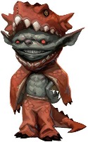
I have a map, each grid is 20 feet and then the grid scale is .25 (so five foot squares within that big grid square). If I zoom in all the way, a token on that map looks like this: When you select that token you get this: It would be nice if the blue squares that appear around a selected token would scale with the map/zoom level.
1405527545

Edited 1405527602
Gold
Forum Champion
I agree & have the same issue when I make maps that are really large area with reduced-size tokens (i.e. the tokens are walking around on a county-size area, not a close-up battlemap scale). It would be super if these GUI features could scale relative to token-size and zoom amount. Another related issue is the measurement reading on the Ruler. It gets too small to read when you're zoomed way out.
1405528527

Edited 1405528996
DXWarlock
Sheet Author
API Scripter
I second this.,and since we are on token elements not scaling, they should all scale the same as the boxes PaladinTodd is suggesting perhaps?: The bars 'height' if possible. when your scaling a big token to small the bars looks great, UNTIL you let go then they go back to the standard thickness. Small tokens end up with bars that look like 3 huge boxes over its token area. when you are resizing it (long as your still clicked to change the size), it looks a LOT better, the entire bars width and height scales: but when you let go its height defaults to the same as the others: Something like this is what I myself think would work much better: